Murugiah on How To Illustrate and Brand a Music Festival
The summer of 2023 has been an amazing year for UK festivals. With memories of the pandemic fading into the background, everything from giant gigs like Glastonbury to small and intimate local events has returned with a vengeance.
Consequently, millions of us have taken advantage of some great weather to enjoy the great outdoors and some incredible bands.
That said, increasingly, festivals aren't just about the music but cover the whole gamut of creativity. And as always, we're keen to point out visual arts are now key to the music festival vibe.
Our favourite festival of all is Green Man, a music, science and arts weekender held in the Black Mountains of Powys, Wales, that really hits that perfect balance between world-class bands and the visual arts. (Not to mention the chilled-out vibe, the beautiful scenery and the 50/50 gender split line-up.) So when we were offered the opportunity to chat with Murugiah, who designed the branding for this year's event, we jumped at the chance!
Read on to discover the thinking behind his Green Man 2023 illustrations and how he went about creating them in practice.
Exploring identity
Murugiah is an award-winning multidisciplinary artist currently living in London. In general, he says, his work is focused on identity. "I'm always interested in speaking about what it means to have different identities through my background as an English-born, Welsh Sri Lankan," he explains. "Stylistically, the work explores identity through vast surreal compositions and vivid patterns and colours."
The way this latest project came about was pretty straightforward. "Like many of my projects, I contacted Green Man festival and asked if I could work with them," he explains. "They said yes, and the rest is history. I've never been one to rest on my laurels. I knew I wanted to work on a festival identity, and I couldn't think of a better one than this one. I'm Welsh and went to school in Newport, which is only a few miles from the Green Man site, so it was very special for me."
The brief was pretty straightforward, too. "It was simply to interpret the various deliverables how I saw fit," Murugiah reveals. "There was an initial concept phase, and the folks at Green Man took a little convincing on my ideas. But eventually, we all agreed on the path and took it. I later discovered the artwork was very well received upon its initial reveal."
Logo and illustrations
Murugiah's process began with a reinterpretation of the famous Green Man Logo. "I wanted to add a sense of three-dimensional geometry and some colour, and I wanted it to be quite playful," he explains. "These are styles I like to play with in all aspects of my work."
He then moved on to the mysterious symbols used to identify the different stages and areas of the festival site. "Once I'd set my own rules for how I would design everything, it became fun to see what could be adapted in new and interesting ways."
After that began what he saw as the most daunting task: the 11 area Illustrations. "I'd never been to Green Man before, despite growing up nearby, so this truly was a massive task," he says. "Creating 11 different drawings in a short space of time, each of which needed to feel different to one another while also having a similar feel, was a tough one."
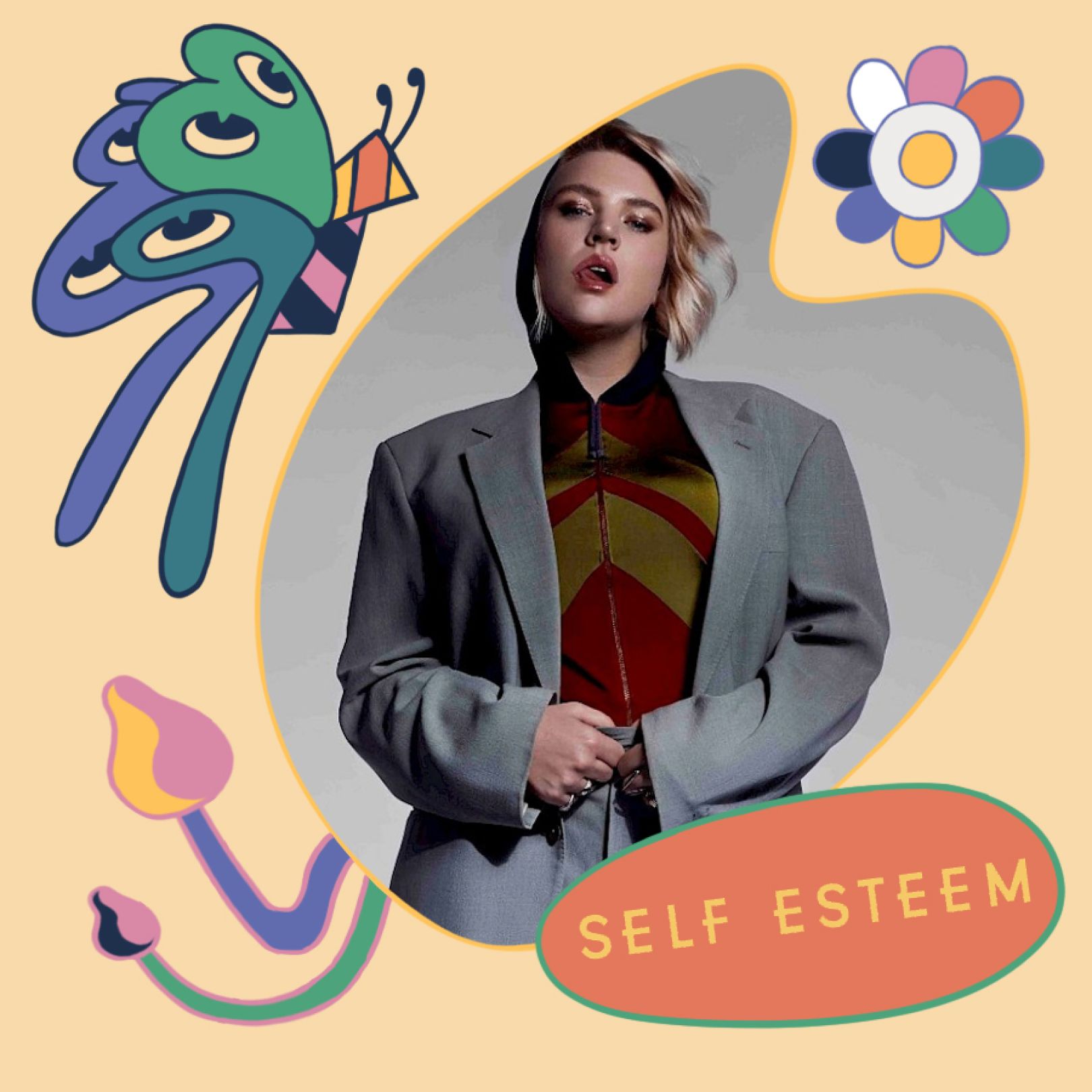
He then made a series of illustrations for the Green Man website to welcome festival guests to the new illustrative take this time around. "For many people, the website would have been the first glimpse at the new designs," he notes.
He started with a homepage header and then created some line-up artist frames. "After that, I was tasked with coming up with a fun character that would dance around the site," he adds. "It was a flower head with headphones frolicking around. Finally, for the website, a frame illustration. The area illustrations were then added to the site."
Poster and merch
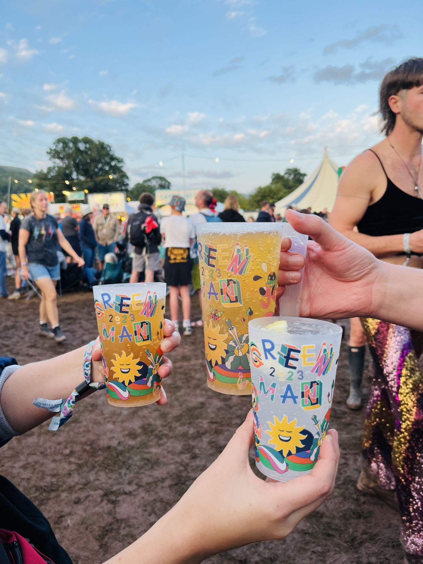
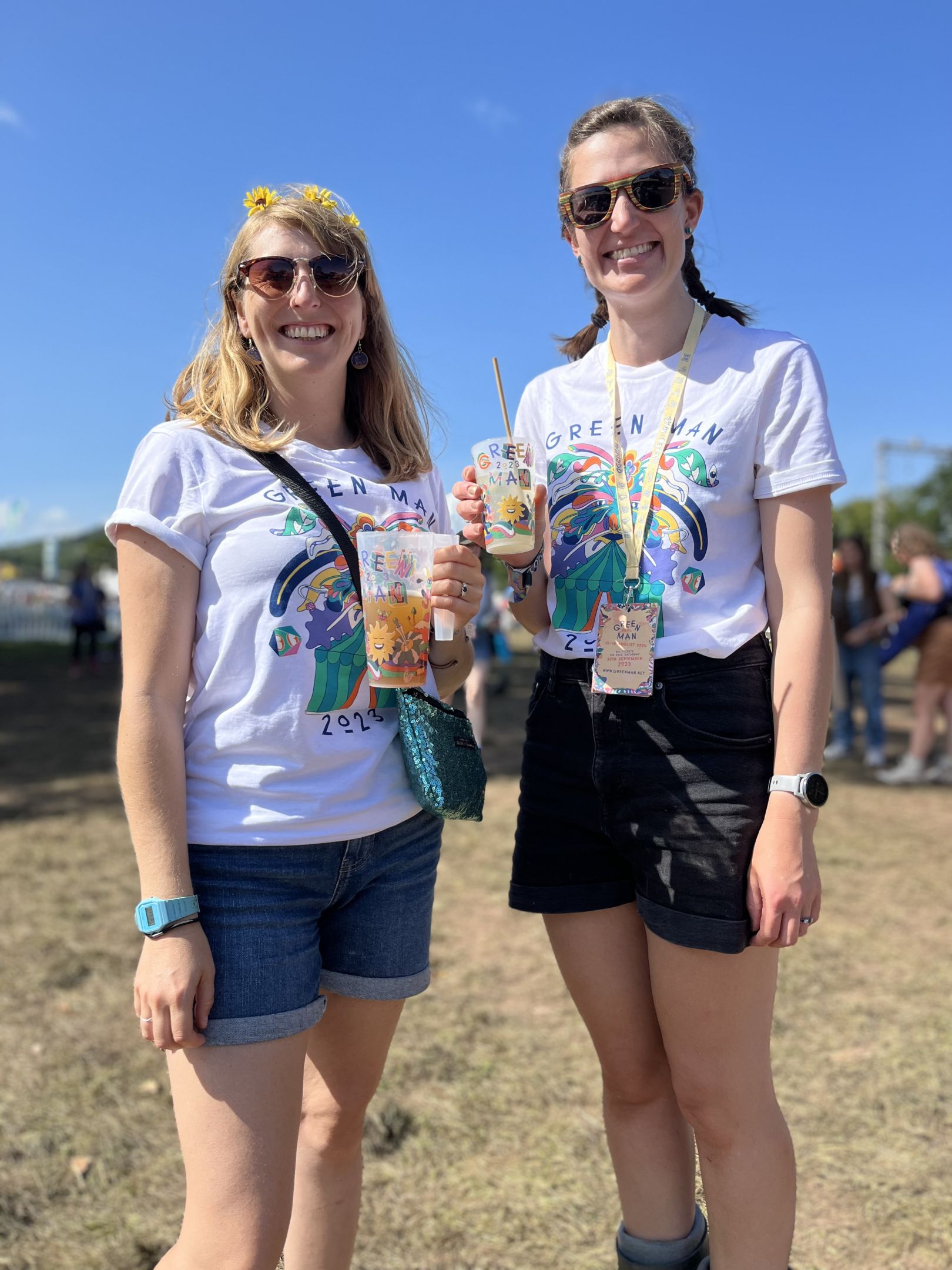
After all this came Murugiah's favourite part of the project: the line-up poster. "I've obviously seen such posters take many forms, shapes and sizes with all sorts of different layouts and setups," he notes. "Luckily, the folks at Green Man said they were looking for something different this year, and oh joy, did I give them something different. I also then designed the program, lanyard, wristbands and stack cups, each taking inspiration from the themes of the main poster artwork."
Overall, Murugiah's designs reflect his typical approach of focusing on identity. "Like all of my work, I'm always aiming to speak to the audience about my own life experience," he explains. "I am Welsh, but I am also English and Sri Lankan. I was born in Burton on Trent near Birmingham and spent my childhood and teen years in Wales, attending school there. My parents, however, were born in Sri Lanka, so I have that South Asian cultural background to draw upon when creating art."
And that cultural mix was central to his Green Man designs for 2023, he says. "For the poster art, I decided to blend Eastern and Western philosophy and depict the titular Green Man inspired by an ancient painting of the bhava chakra in Sera Monastery, Tibet. The inclusion of arms and feet, along with the yellow circle, is in reference to Eastern iconography's Wheel of Life from the Bhavachakra painting – mixed with the traditional folklore of the Green Man. The poster features a cast of my fave characters, also designed with my cultural reference points in mind."
Once all his designs were complete, it was time to add some movement. To achieve this, Murugiah worked with the animation studio Plastic Horse and the art directors for Green Man festival; a team called Many Hands. "I actually had very little time with the animators except to prepare my files for animation," he explains. "I'm told my work lends itself to animation very well, so I'm always pleasantly surprised to see how animators interpret it. It was wonderful to see the animations playing while each stage act was getting ready to play."
Work and play
This was Murugiah's first time working for a festival, which he describes as a fun experience but also quite a lot of work. "There were so many small bits and bobs to do," he notes. "These past few years as an artist and illustrator have been my busiest so far, so I took on many commissions while also working on the festival."
Despite growing up nearby, it was his first time at Green Man. "It was glorious to go," he reports. "Green Man was kind enough to supply me with extra tickets so I could take some friends, and we had an amazing time. I ate the same meal nearly every day at a place opposite the Mountain Stage that served crepes. By the third time, I was making friends with the owners. I had fun at Chai Wallas and the Drag tent and spent much time at the Mountain Stage with that glorious view; wow!"
He found it exciting, too, to see his work everywhere, although at first, it was a little worrying. "After the art left my studio, it was up to the team at Green Man to materialise it and present it in all of its forms," he explains, "so it's always a bit nerve-wracking to see how all of it is printed and presented."
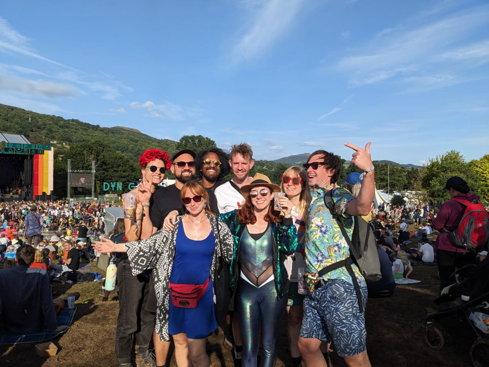
"Once I got there, though, I soon relaxed as I had seen how much love the festival had for the art," he continues. "They used it everywhere. Animations at the stages, stack cups, all the merch, even temporary tattoos. Seeing so much of the art reach so many people was truly amazing! I feel very blessed."
But while he's proud of what he created, he still hopes Green Man goes in an entirely different direction next year. "I think it's very important to try new things, especially when you're a festival like this, which already has such a strong identity and theme," he explains. "I'm looking forward to seeing who will interpret the themes and symbols next year. And I will suggest artists I think will do an amazing job."
Source: creativeboom.com
